This is the craft template for RoadRunner Monorail. I wanted to use the two colors of the logo on the craft itself and was a bit worried that they would be overpowering. But I found that using white as the main craft color helped ease the impact of the other 2 colors.
DKiser Designs
My name is DKiser and I am a student at New Mexico State University studying Graphic Design. This blog showcases a sampling of my work in photography, graphics, and typography. I hope you enjoy it. All images and photographs are the property of DKiser Designs and subject to copyright protection. You may not copy or reproduce any image or photograph in any way without the express permission of DKiser Designs. Thank you.
Friday, April 22, 2011
RoadRunner Monorail Craft Design
Friday, April 8, 2011
RoadRunner Monorail Logo
This is a logo I created for a fictitious monorail company based in the southwest. I wanted to do something that was not only a simplified form but that would also suggest speed. I also wanted to stay away from the stereotypical colors that are associated with the southwest so I went bold and vibrant blue and red/orange. The result is a dynamic streamlined logo.
All images and photographs are the property of DKiser Designs and subject to copyright protection. You may not copy or reproduce any image or photograph in any way without the express permission of DKiser Designs. Thank you.
Thursday, April 7, 2011
Kiser Architects
This is an advertisement for a fictitious architecture company. The image is a photograph I took of the Bonaventure Hotel in Los Angeles. I wanted to experiment with paring a dynamic image with simple type.
All images and photographs are the property of DKiser Designs and subject to copyright protection. You may not copy or reproduce any image or photograph in any way without the express permission of DKiser Designs. Thank you.
Flora Allura
This advertisement was part of a group project. We were given 2 hours to come up with an "Earth Friendly" product, a name, a tag line, and advertising visual. This is the end result...
DKiser Designs Business Card
Here are my business cards. Rather than just use my initials in a traditional sense, I wanted to experiment with form. So I played with placing the letters in different positions and and experimented with various typefaces. The result is an image that reminds me of a king. Interestingly enough, my last name means "King" or "Emperor" in German.
All images and photographs are the property of DKiser Designs and subject to copyright protection. You may not copy or reproduce any image or photograph in any way without the express permission of DKiser Designs. Thank you.
DDC
This is a post card created for the Digital Design Conference in Phoenix, AZ. The image in the background is of a cactus and is actually a photograph I took. I felt it worked well because of the location in which the conference was being held.
All images and photographs are the property of DKiser Designs and subject to copyright protection. You may not copy or reproduce any image or photograph in any way without the express permission of DKiser Designs. Thank you.
Bici Directions
This is a set of directions created for a bicycle tire repair kit. Requirements were that the directions be 100% graphic based with no written text and that it be in English and 2 other languages.
All images and photographs are the property of DKiser Designs and subject to copyright protection. You may not copy or reproduce any image or photograph in any way without the express permission of DKiser Designs. Thank you.
Hoefler Text Poster
This was a typography project I did where I had to design a poster that showcased not only the Hoefler Text typeface but I also used Hoefler Text to illustrate the designer who created it, Jonathan Hoefler.
All images and photographs are the property of DKiser Designs and subject to copyright protection. You may not copy or reproduce any image or photograph in any way without the express permission of DKiser Designs. Thank you.
Mesilla Valley Onion Festival
This is a logo I created for the 1st of an annual event, The Mesilla Valley Onion Festival.
My class was tasked with coming up with a logo that included 3 elements: 1) an onion, 2) a pineapple (the international symbol for hospitality and welcome), and 3) the words "Mesilla Valley Onion Festival".
I was at a complete loss for how to incorporate an onion and a pineapple together. Then, I saw an image of an onion cut in half and occurred to me that maybe I could do an image that looked like a half onion but the inside would look like a slice of pineapple.
Even though we were told that we could only use one color, (black) I decided to do a rendering that had 2 colors. I feel it is more successful.
While we were told our designs would be judged by the MVOF committee and one would be selected to be the logo, it turned out that the contest ended weeks before. It was a bit aggravating to spend so much time doing a design for a contest that was already over.
In any case, I think it is a nice addition to my portfolio.
All images and photographs are the property of DKiser Designs and subject to copyright protection. You may not copy or reproduce any image or photograph in any way without the express permission of DKiser Designs. Thank you.
Club Cherry (RIP)
This is what I submitted for my final project in my Illustrator class. I had to design either a poster or bookcover so I decided on the poster.
I wanted to really create a sense of plasticity with this image. The super high gloss on both the lips and the cherry help to create that feel. I also wanted to limit my color palette to just red, black and white.
The inspiration for this design harks back to my days of living in Los Angeles. Club Cherry in Hollywood was THE place to be...everyone who was ANYONE was there.
While the club may no longer exist today, it certainly had an impression on me. How I miss thee...
All images and photographs are the property of DKiser Designs and subject to copyright protection. You may not copy or reproduce any image or photograph in any way without the express permission of DKiser Designs. Thank you.
Wednesday, April 6, 2011
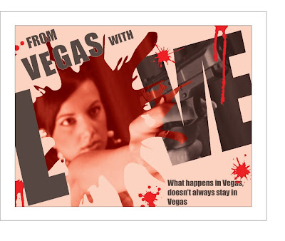
From Vegas...
I subscribe to a magazine called Layers. Its put out by Adobe and is FILLED with tips, tricks, and hints on how to navigate through the various CS4 and CS5 programs. I found a little article on how to work with masks and how photographic images can be used with various tools and functions of the program. This is a little something I did after learning some new techniques in Illustrator.
All images and photographs are the property of DKiser Designs and subject to copyright protection. You may not copy or reproduce any image or photograph in any way without the express permission of DKiser Designs. Thank you.
e-Cig (Spoof Ad)
This design is my first real go at Photoshop. While I took a class on it in the past, I've not touched the software for several years. My biggest challenge was figuring out the tools and how they worked . . . specifically, how to create something that looked like real smoke. In the end, I decided to see what I could find on youtube.com. Boy, what a difference! I think the end result speaks for itself.
All images and photographs are the property of DKiser Designs and subject to copyright protection. You may not copy or reproduce any image or photograph in any way without the express permission of DKiser Designs. Thank you.
Lucille Ball
I've always been a fan of "Classic Hollywood". So for my Illustrator class, I decided that I would attempt to illustrate the Queen of Comedy herself, Lucille Ball. My professor felt it was a resounding success.
All images and photographs are the property of DKiser Designs and subject to copyright protection. You may not copy or reproduce any image or photograph in any way without the express permission of DKiser Designs. Thank you.
Thursday, August 26, 2010
Road Trip
The following are photographs I took while on a recent road trip to Los Angeles. There are images of the beach, the Los Angeles skyline at night, various shots of Hollywood, a couple of rest stops and several other places I visited along the way. In doing this project, I really wanted to focus on composition and framing. Overall, I'm very pleased with the photos I took and look forward to my next project...
All images and photographs are the property of DKiser Designs and subject to copyright protection. You may not copy or reproduce any image or photograph in any way without the express permission of DKiser Designs. Thank you.
Friday, May 14, 2010
NM Photo Contest
The New Mexico Tourism Department is hosting a contest for the best photograph which captures the Enchantment of New Mexico. I submitted these five images in the hopes of winning one of the 7 prizes or the grand prize of $10,000. Please visit http://www.dayofenchantment.com/entries?sort=search&keywords=dkiserdesigns to vote for my images.
All images and photographs are the property of DKiser Designs and subject to copyright protection. You may not copy or reproduce any image or photograph in any way without the express permission of DKiser Designs. Thank you.
Future
This was a project I did for my Illustrator class. The objective was to take an image and break it down to its different value parts; Highlighted areas, mid-tone areas, and low-light areas.
Irving Penn Emulation
I had to do a photo project where I emulated the style of 2 famous photographers. This is the first of the two projects. Irving Penn made a name for himself as a fashion photographer for Vogue Magazine in the 1940's before founding his own studio in 1953. His images of gutter trash capture the extraordinary physical beauty of these pictures as objects. I hope I've done him justice.
Bernd and Hilla Becher Emulation
The 2nd photographer I decided to emulate was actually a German couple named Bernd and Hilla Becher. They are best known for their photographic images of industrial buildings and were intrigued by the fact that so many of these industrial buildings seemed to have been built with a great deal of attention toward design. They would photograph their subject without the typical play of shadow and light, camera angles or dramatic compositions. I found their work to be quite beautiful and I think I enjoyed this project the most.
Tuesday, May 4, 2010
Abstractions
This was a photo project I did back in November and December of '09.
The project started out very different from the final product. My original proposal was that I would photograph elements that induced fear in people, i.e. spiders, clowns, heights, etc.
Upon critical feedback of the some 3000 images I took, I was told that none of my images were "scary" and that I needed to reevaluate my proposal.
So, rather then just reevaluate my proposal, I decided to take the few successful images that DID work and completely reshoot the project with a different objective.
The result was a collection of images that are almost recognizable yet very abstract. The very first image (Column of Mirrors) was described as "genius" by my photography professor.
I hope you enjoy :)
Subscribe to:
Posts (Atom)